- Home
- Video Courses
- Certifications
- PL-100: Microsoft Power Platform App Maker Dumps


PL-100: Microsoft Power Platform App Maker Certification Video Training Course
PL-100: Microsoft Power Platform App Maker Certification Video Training Course includes 13 Lectures which proven in-depth knowledge on all key concepts of the exam. Pass your exam easily and learn everything you need with our PL-100: Microsoft Power Platform App Maker Certification Training Video Course.
Curriculum for Microsoft Power Platform PL-100 Certification Video Training Course


PL-100: Microsoft Power Platform App Maker Certification Video Training Course Info:
The Complete Course from ExamCollection industry leading experts to help you prepare and provides the full 360 solution for self prep including PL-100: Microsoft Power Platform App Maker Certification Video Training Course, Practice Test Questions and Answers, Study Guide & Exam Dumps.
Expanding our canvas app
5. Adding rectangles and Adding New Items
In this video, we're just going to do a bit of tidying up, a bit of formatting, and add, I think, one or two more icons. So first of all, thisisn't looking particularly pretty. So what we need is, first of all, to insert a label. So I can either go insert a label or I can go insert a text label. And I need to put in "let's narrow this down just a bit. The name. So this is the account that we're doing, isn't it? So we're just going to call it accounts. So that belongs in the text. Now, it's still not great in terms of formatting. So what I'm going to do is insert a rectangle, and that's over here in the icons right at the bottom. So we've got pentagons, hexagons, and a rectangle. So I'm going to insert a rectangle and put it on top of here. Now we can't see anything, unfortunately now.So what I'm going to do is right-click on the rectangle and reorder. And I can either send it backwards, which means it goes back one control, which is good if you really want finetuning, but actually I want it all the way to the back because I want to see everything on top of it. So now I've done that. The colours are a bit too dark for me. So let's have a look at the properties. Go down to the color. Let's just make it a lighter color. There we go. So I'm going to copy that rectangle, go to another screen, and just paste it in for Control-C and centre back.Save the browser. Again, I'll send that to the back because I'll be putting some icons on top of this centre back. And I'll also do that with this label as well, so we can have consistency. So I can change this. This is the browse screen, for instance, and then this one is the detail screen. And then we go to the edit screen. If you think that sort of thing would actually help the end user, it's worth putting in there. But do bear in mind that this is for a phone. So it could be that you don't exactly have that much space to play with. So you can choose whether to have a darker screen or maybe to have these in white, for instance. Or you can have a lighter heading and have these in black or some other colour as you see fit. Now let's go back to the browser screen. I want an icon up here so that I can add a new item. So previously, we had a submit form reset form, which changes a form to an edit screen. We don't need that for this particular app. But there is also a new form. So I'm going to insert a new icon here. So let's add a plus icon. There we go. Have it at the top right composition. It's where I want. And in the OnSelect, we say that the edit form has to be a new form. So I can add a new item. Now, that won't actually take me there. We then need to have a navigator. We need to actually get to the edit screen. So we need both of those to add a new item, a new form, and a navigation. So there we go. So let's test this out. So play. So if we click on this, we get to the screen, and this is no longer an edit screen. This is a new screen. Let's change that. So we go into this edit screen, and what I can now say is that I can use an if statement. So if it takes an argument, it takes a Boolean result. Is this true, or is this false? So what I want to know is, is this editor's mode? Is this in edit mode? If it is, then give it to me as an edit screen. If not, then give it to me as a new item screen. For example. So you can see if it's used exactly the same as in Excel. So give me a condition. So in this case, we're looking at the form. Are we editing? If I put edit, then I should put new. And that goes in the text. So what is being displayed? So let's have a look at it again. So go right back to this browser, press Play, and click on the Plus. We have a new item. Instead, if I look at a particular item, we go to an edit screen. So that's how we can use the IF formula. So in this video, we've added a bit of style, adding those rectangles and headers, and we've also added the plus icon, which allows us to create a new item. In the next video, let's look at the order of all of these items in the gallery. Try and get it into alphabetical order, either ascending or descending.
6. Sorting and refreshing our gallery, and Deleting Items
Now it looks like we are not doing a good job in terms of the order. And I'm not sure what order this is. I can deduce it by looking. It seems to be on the telephone order, but I'm not entirely sure about that. So what I'm going to do is I'm going to click on the gallery, and you can see that the items come from the accounts table. So let's keep it there. But I want to sort by columns. So I want to sort the accounts table by, and I just want to look at it. So we can just scroll down and find her name here. So this is the name of the account name in the column. So now, you can see instantly that it has been sorted. We can have a third argument over whether we want ascending or descending. So I'll leave it there for the time being. Now you should note that we've now got a problem. Let's have a see what the problem is. And the problem is, believe it or not, I didn't put a capital A on it. As a result, there are times when you should probably just use autocomplete. It just saves time in that way. Now, there are a couple of things I want to add. Let's add an icon for refreshing the data in case somebody else adds information to it separately for this Power app. So maybe multiple users are using this Power App. So I will find a refresh symbol. There we are reloading; put that there, and it will be the refresh function. So, what are my reviving and reviving accounts? And then finally, let's delete let'sget a delete symbol of bin. Maybe I don't want a particular item. We're adding an item. Let's see if we can delete an item. So again, let's see if we can find the trash bin. There we go. And I'm going to click inside the "select" on select.And this removes what is currently selected from accounts. So we're talking about this gallery. So gallery two dots were chosen. And then we probably won't need to see the screen anymore. I'll say that back. So let's now test all of this. So we'll go back to here and play. I will add a new item. So first, a coffee house. Telephone number: V 1234.We're in Orlando, Florida. Email address: coffee@now.com. So, there we go. Let's look. Do we have our first coffee? And yes, there it is. so I can click on it. I can overlook that it doesn't have a country, doesn't have a region, and doesn't have a county because the edit screen doesn't include those details. So be cautious about what you put in your edit screen. You probably need more than what's in your detail. So that's looking pretty good. I'll refresh the data. There we go. The data is refreshed. No changes need be made. And I'm going to bin this item so you can see it was working and now it's no longer there. So in this video, we've had a look at some of the finishing touches that you might want to add. For instance, we added a rectangle that's in the icons and right at the bottom, where you can see all of these other shapes. We've added a refresh button, and we've added an add button that uses a new form and then navigates. There we've added a delete icon, which removes what we're currently looking at and then goes back to, presumably, the browse screen. And we've also sorted the gallery. We've sorted the gallery by items. It was really just saying account and now we aresort by columns account and we're sorting by name ascending. So you can see that this is now fairly similar to what we automatically had. So here is our previous version. And of course, if you can save time by having such a version instantly created, then absolutely do so. But what we've done here is to be able to go through various ways of creating these screens. So first, we can customise it. Secondly, we're getting used to being able to use navigate and back and all of the forms, including the edit for a new form, reset form, and view form, and make your own apps.
7. Practice Activity Number 2 - The Solution
Right, well, how did you get on with this practise activity? So, first of all, I wanted you to add a display form to our existing screen. So here we go. Insert forms and display them. And I'm going to shift it to the right side. So just drag it and go ahead and set it up so that these two do not overlap. Now, the form isn't connected to any data. So what I'm going to do is go to the data source and click on "Users." Now I need it so that it displays the information on one particular item in the gallery. So I'm going to go into "advanced" and into "item." I'm going to find out the gallery name. So. At the moment, gallery one is open. Again, you may wish to rename these and not select any. So this is how it looks. I prefer, in this particular instance, for there not to be three separate columns. So I'm going to change that going into the properties, and I'm going to change the number of columns to one so they can be underneath each other. Next, I need to add a couple of fields. So go to fields, edit fields, and then click "Add Fields." And I'm going to add in the principal email, the primary email, and the licence type. So next, I want an icon at the top. So I'll add a bit of space. And I'll give a bit of space for the gallery as well. Let's have them at the same level. So I'm going to insert an icon so I can edit the data that's there. So I'm going to put it all the way here. So let's just move this button on the form itself down a bit more. Same for the gallery. Now, when I click this, it should go into a separate screen. So I'm going to add that separate screen first. So go to "new blank." And then I will insert an edit form. Again, I'm going to select the data source. I'm going to go down to item and say Gallery One once more. Dot selected. Obviously, if yours isn't called Gallery One, then you will need to say what it is. And I'm going to add the additional fields. Again, the principal primary email andthe licence type as well. Now, that's not a lot of space, especially to enter the primary email. So again, you should consider how many columns you need. So should it be two columns? But what I'm going to do is change it to one column, but with the layout being horizontal. So I think that gives me the best of both worlds. It allows me to have space and yet not have a huge amount of height. Right, so now we've done that. Let's connect these two screens together. So we've got this icon, which at the moment does nothing, but in the OnSelect property for the icon, we can say navigate. And I want to go to screen two. Now, screen two is obviously not the best name for it. So let's rename these screens. So I'm going to call this the detail screen. And I'm going to call this the edit screen. And you will notice when I go back to the icon that it has automatically updated the formula. So it no longer says "Navigate screen two." Right, so now let's add in working submit and cancel icons at the top of the screen. So I'm going to go into the icons, and I'm going to go check. So that is my submission. And what I need to do is to submit the form. So I'm not submitting the screen, I'm submitting the form. So the only form I've got is Form 1. Again, you might want to rename that. So edit the form, perhaps? Now that you've clicked on it, you don't want the form to still be there. You want it to go away. Depending on your location, you could have one or two semicolons back. You could also go to the form and then to the success. So if the form has been successfully saved, then you go back. So similarly, we're going to have a "Don't Save" button. So let's go to the icons, click on the X, and select here. We're going to reset this form so we can get it back to where it was. So we have the Edit form, and we also go back so we can test this. Now, if you return to the DetailScreen and I go say something to you, So power the platform plan, so I can change it. You can see that works. So I'll click on Edit, and I'll put in a new title. So, for instance, check that, Mr. And now you can see it has been saved. And I'll put in a new main phone as well. So 412-345-6789. There we go. Great. And let's just do one more change. Put a zero at the end and press this X button instead. and you can see it hasn't actually changed. so that all works. Now let's have a look at just purifying a little bit. So I want some rectangles in the background at the top. So I will insert, and do you remember where rectangles were? It's in icons. So I'll insert a rectangle. Now, notice it's gone above the icons. So I don't want that. So I'm going to turn right and click and go to reorder, then centre back. Also, the actual colour is a bit too strong. So I'm going to change this to a light green. Now let's also add a title. So I'm going to put in some text, a label. So this is going to be the edit screen. So I can just say "Edit user details," for instance, in speech marks. So similarly, I can go to the Detail Screen and add in two rectangles, as I think that might just aid navigation so people can see that there's something on the left and something on the right. So there's one. I'll just leave a bit of a gap and then add in another rectangle. Move it over there. Again, I will send this all the way to the back so you can see the icon that we have for the pencil icon.Again, I'm going to change the color. So I'm selecting both by clicking one and holding down Shift and clicking another. That alters the properties of both. And I'm going to do it again, with a label. So this could say something like all my users, and this one over here could say the user you've clicked on or maybe the current user. So that just might help the end user navigate the fact that there are two different things on the same screen. And then finally, I want a refresh icon. So let's just have a look for the word "reload." There we go. Put it over here. So again, having the icons in the same place on the right hand side of the rectangles also helps the end user go, "Okay, I have a section left and a section on the right." And I have refresh on select. But what am I refreshing? I'm refreshing a data source to see what my data source uses. So now that just refreshes the source data. Maybe it's changed elsewhere. So if I play, I can click on all of these. I can scroll down and up. I can go to my current user, and I can edit it. I might have a lot more fields than just what I'm seeing in the Details section. And then I can change what I want and have it saved, or I can make changes and abandon those changes. And it looks a bit more stylish than it did previously. And finally what I'm going to dois I'm going to save it. I'm going to go to FileSave; just make sure it's saved. So in this practise activity, we developed our Canvas app further. In the next section, we're just going to takea step away from canvas apps themselves and havea look at designing the data model. We'll go into the database, create new tables, new cars, and columns, add calculated columns, and roll up columns. Please join me there.
Designing data model - Part 1
1. 1-4. Create a high-level design
Hello. And in this section, what we're going to do is expand the Accounts app. We're going to create another table, link it to our existing table, and then expand our app accordingly. So let's just have a reminder of where we are. So I'm currently at Makeup Powerapps.com, and I'm in the proper environment. So click on apps, and here is my Accounts app. And I can edit it or play it. So let's just play it. So as a reminder, we've got all of these different accounts. And what we can do is we can have a look atthe details, we can edit it, we can accept the changes ornot, we can bin it, we can go back to the mainscreen, we can add a new item which gets us back tothe edit item window or screen, but it doesn't actually contain anyvalues and we can refresh the data. So that's why we are so far. So we've got all of these accounts. Now it could be that I'm doing marketing and I'mgoing to be spending company money on these accounts. Maybe I'm going to take some people from the marketing department, who know of a deeper corporation, out for lunch. Right, well, that's okay, but I need to be able to register that lunch. I need to be able to, for instance, say, "These are the expenses for that lunch." So what we're doing is collecting business requirements for our app. So we've got accounts, and we're going to be adding expenses. So identify the data sources. Well, the data source is going to be whoever adds in that expense for a particular account. So it could be a receipt. It could be that we just had some petty cash. So what we need to be able to do is record items from that. So describe the real world objects as entities. While we have accounts as payable, we may also have expenses. Expenses can also be on a table. Now, within that table, we might have other things. We might have columns previously known as fields. So we could have, for instance, the date that the expense happens. We could certainly need the value. We need to obviously have the account; we need to link it there. We may need other things. For instance, maybe it needs to be approved by somebody. We probably need a description, maybe where it was. So each of these would be columns in our table. So describe the user experience, or what I want to be able to do, perhaps, is go to a particular account, maybe have a dollar symbol up here, and then see a list of the expenses already there and add a new one. So in other words, we've got something very similar to what we've already got. We just need to add the extra screens to this app. But we could start off, say, with a dollar sign here and then create a high-level data model. Well, that's something we'll be doing in the next video when we have a look at determining the required entities, identifying relationships, and the fields and data types.
2. 13-15. Design data models
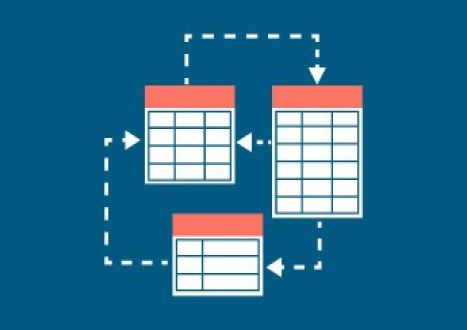
So in this video, we're going to have a look at designing the data model for our app. So we've already got the accounts, which is a table, and we can see that it's got various columns. So, for instance, we've got an account name, and I think that has a stake in you. If you're not sure whether space exists or not, you can go back to makedot power ups.com, scroll down to data tables, and look at the account table. And you can see all the different columns that we've got here. So here is our ID. And if I expand this, you can see it is an account name. So that is our primary name column. That is the thing that uniquely identifies a particular role. So that is our column, and there are various other things. For example, we have got the city, the main phone, the county, the country region, email, and so forth. And you can identify the display name and the internal name if you want to hear them. So this would be the address, for instance, for one city for instance.And we can also have a look at our existing app and see what it uses. So all of these are columns. Now, I also need an expenses table. Why is it going to be a table? Well, what we're going to have, for instance, is one particular account that's going to have multiple expenses. So zero, one, or more than one Now if it were just one, and every single account was going to have one expense, then it could just be a column in this table. However, that's not going to be the case. I mean, some accounts may have no expenses, but you can imagine we probably will have multiple expenses. We probably won't just be able to stick with one. Now, are we going to have the table called "Expenses" or "Expenses"?Well, the name of our table—here I put the word account—is It's actually account singular, so let's keep it in the same style. So we have the singular. So what sort of things do we need on our expense table? So what sort of columns? Well, we may be looking, for instance, at the description; we could be looking at the value; maybe the status doesn't need approving, for instance; has it been approved? No approval is needed. We need the date of the expense, and there probably will need to be a primary ID column, the primary key, and we also need to be able to link to the account table. So this would be a relationship rather than a column. And what happens in the data verse is that this also becomes a lock up. So the database handles the relationship. We just need to tell it that there is going to be a relationship between these two tables. So let's draw a line between the two. Now, one account can have multiple expenses. Now, could it be that multiple accounts can have the same expense? I wouldn't do that. It really gets complicated if you go away from the one-to-many relationship. For instance, if I said, "Well, we had these two different accounts and we wined and dined everybody there and it came to $50," you can split it at $25 each to keep the one to many.Once you say, "Well, both of them have taken advantage of the $50," you then start to get fairly complex in database terms. So let's try to avoid too many where we can. So we determined the required entities. We have columns with relationships between them. We have identified the columns themselves—the data types. While the description is going to be some sort of text, the value is going to be some sort of number status text, the date of the expense is going to be a date type, and the ID is going to be the primary key. So we're going to see if we can get something that the computer can automatically generate for us, so we don't have to be worried about that. Then we'll deal with the account table relationship lockup separately. So we have had a look at the data model that we need for this high-level design. So what we're going to now do in the next video is create the expense table in the database, and then we can refine what all of these column types are going to be. For example, are there more than one type of text? Number and date column types?
Student Feedback
Download Free Microsoft Power Platform PL-100 Practice Test Questions, Microsoft Power Platform PL-100 Exam Dumps
| File | Votes | Size | Last Comment |
|---|---|---|---|
| Microsoft.pass4sure.PL-100.v2024-06-01.by.santiago.122q.vce | 1 | 1.67 MB | |
| Microsoft.examanswers.PL-100.v2021-12-22.by.holly.116q.vce | 1 | 1.42 MB | |
| Microsoft.examlabs.PL-100.v2021-11-03.by.martina.93q.vce | 1 | 1.53 MB | |
| Microsoft.actualtests.PL-100.v2021-09-30.by.ethan.78q.vce | 1 | 1019.34 KB | |
| Microsoft.realtests.PL-100.v2021-08-26.by.gabriel.49q.vce | 1 | 866.34 KB | |
| Microsoft.pass4sure.PL-100.v2021-07-20.by.captainmarvel.38q.vce | 1 | 685.59 KB | |
| Microsoft.testking.PL-100.v2021-04-27.by.thea.20q.vce | 1 | 350.88 KB | |
| Microsoft.pass4sure.PL-100.v2020-10-01.by.leo.21q.vce | 2 | 954.52 KB |
Similar Microsoft Video Courses

























Only Registered Members Can Download VCE Files or View Training Courses
Please fill out your email address below in order to Download VCE files or view Training Courses. Registration is Free and Easy - you simply need to provide an email address.
- Trusted By 1.2M IT Certification Candidates Every Month
- VCE Files Simulate Real Exam Environment
- Instant Download After Registration.
Log into your ExamCollection Account
Please Log In to download VCE file or view Training Course
Only registered Examcollection.com members can download vce files or view training courses.


Add Comments
Feel Free to Post Your Comments About EamCollection's Microsoft Power Platform PL-100 Certification Video Training Course which Include Microsoft PL-100 Exam Dumps, Practice Test Questions & Answers.